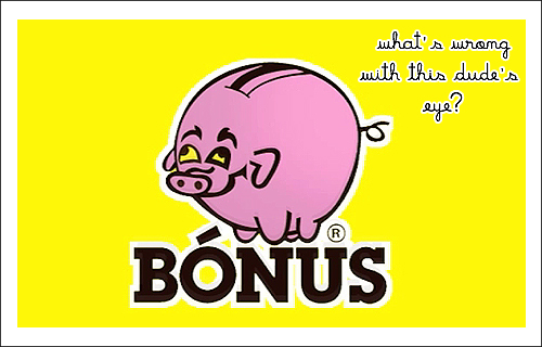
I won’t hide it: this matter has been bothering me for months. Every time I am in the proximity of a Bónus supermarket or I see somebody carrying the infamous flashy yellow bags, I experience a stabbing feeling in my eye. At first I couldn’t exactly point out why. Yellow definitely isn’t my color of choice and I am anguished by the fact yellow is a fairly frequently associated color with the image of low-cost supermarkets; I admit I am always tempted to stay away from anything that sports such outrageous amounts of yellow, but in the case of Bónus it wasn’t yellow that was bothering me so much.
Despite the sympathy one could feel for anything low-cost in our financially troubled times, Bónus has a rather dishonorable history projecting sinister shadows over its reassuring “no-frills” policy that still makes it despicable for more than a few Icelanders. For those who don’t know, the first Bónus was co-founded in 1989 by businessman Jóhannes Jónsson and his son, the notoriously much-hated Jón Ásgeir Jóhannesson, one of the villainous individuals that led to Iceland’s 2008 banking collapse. Just to name one example to make you understand how much hate – most certainly well-deserved – there is against Jón Ásgeir Jóhannesson: nobody managed to write an entry about him on Wikipedia without falling into the temptation of speaking ill of him, so now there’s no Wikipedia page to objectively inform the misinformed public regarding his evil deeds – Wikipedia’s staff had to delete the entry on the grounds it was an “attack page”, something “that was created primarily to disparage its subject”.

Apart from considerations about ill-gotten money and how bad people always manage to get their asses out of trouble… What has been bothering me, I found out all of a sudden the other day, is realizing Bónus Piggy Bank has a black eye. Besides the aggravating strabismus. I don’t know why this is so upsetting, but the more I look at it, the more I can’t get over it. Seen in retrospect, this grotesque metonymy – that the symbol of the creature of one of the culprits of the financial collapse should have a periorbital hematoma – is perhaps even hilarious. But looking at it simply as at a commercial logo that somebody actually took the time to conceive and design, the dumb looking black eyed piggy bank is rather disturbing. Who’s the lousy designer behind it? I would really like to know.